Juniper & Plaster — Design Direction
Editorial design system for a design-led brand.
1. The Problem
Design studios need a presence that demonstrates their own taste and craft. A generic site undermines the offer; the system has to feel like part of the portfolio—editorial, considered, and unmistakably theirs.
2. The Strategy
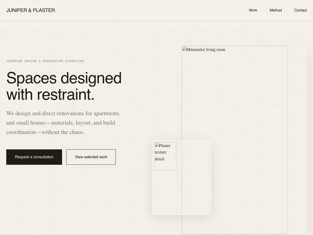
We built an editorial design system: paper-like backgrounds, ink typography, and a structure that puts design direction front and center. The site is both proof of craft and a clear path to contact.
- Editorial layout and typography
- Clear narrative and project showcase
- Refined, design-led aesthetic
- Mobile-first layout
3. Design Direction
Warm paper whites, ink browns, and clay accents create a tactile, editorial feel. Serif and sans pairings keep it readable and distinctive—the kind of system a design studio would want to show off.
4. The System Includes
- Narrative and project sections
- Clear hierarchy and contact
- Consistent design language
- Mobile-first layout
5. The Experience
Visitor lands on the site → Scrolls through design direction and work → Understands the offer → Reaches out. The experience is the argument: this studio practices what it sells.
6. The Result
What this system improves: A single, coherent design presence that acts as both portfolio and sales tool. Clients see the system and think, “They understand how this works.”
7. The Visual Showcase